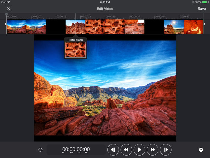
Portfolio began as an offshoot of a more specific app I made for our photography business. While we no longer have a need for that original app, Portfolio has been in continuous development for five years now.
Over its lifespan it has had almost 80 updates, and in that time its interface has evolved significantly to meet the needs of its users. It has gained numerous features and customization points with the constant battle to minimize complexity and keep it usable – the core flow has never changed for that reason. Still, I have said no to far more feature requests than have ever made it in.
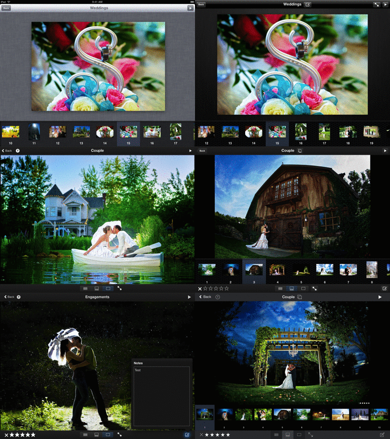
This animation shows the evolution of Portfolio’s viewer from version 1.0 in August 2010 to the current version.
Home
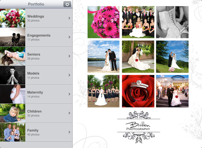
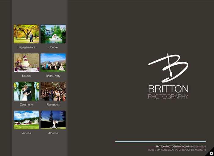
The original home screen for Portfolio was pretty limited compared to its current incarnation. Customization was limited to choosing an image for landscape orientation and one for portrait. Today you can create almost any layout and fit the look you want.
Portfolio 1.0
Portfolio 4.0
Appearance
The appearance customization panel has probably seen some of the most visible changes. In its first version the only customizations allowed were the landscape and portrait home screen images; by 2.0 it had gained some color customizations; 3.0 brought user-creatable themes and options to tweak different behaviors in the viewer; and 4.0, this year’s major update, brought further refinements and a new interface.
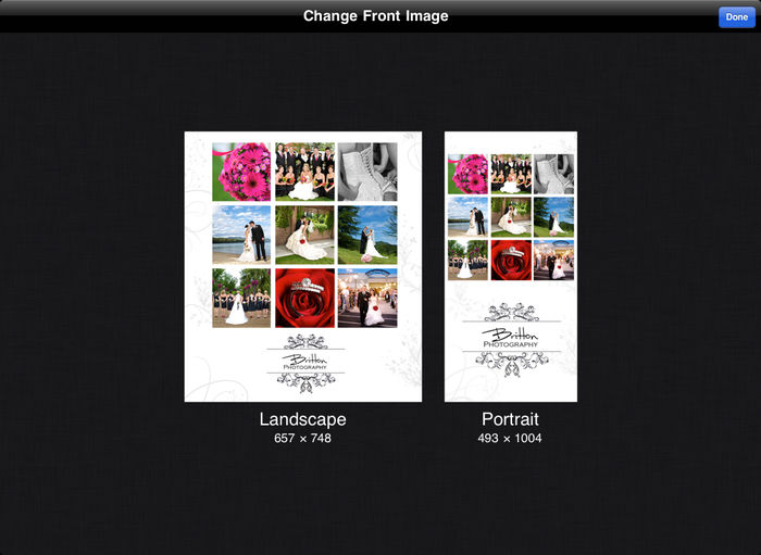
Portfolio 1.0
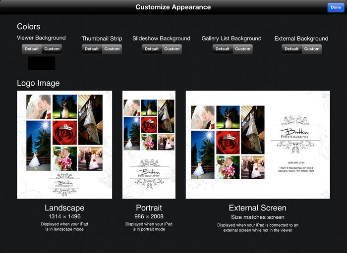
Portfolio 2.0
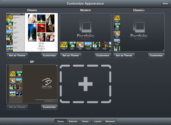
Portfolio 3.0
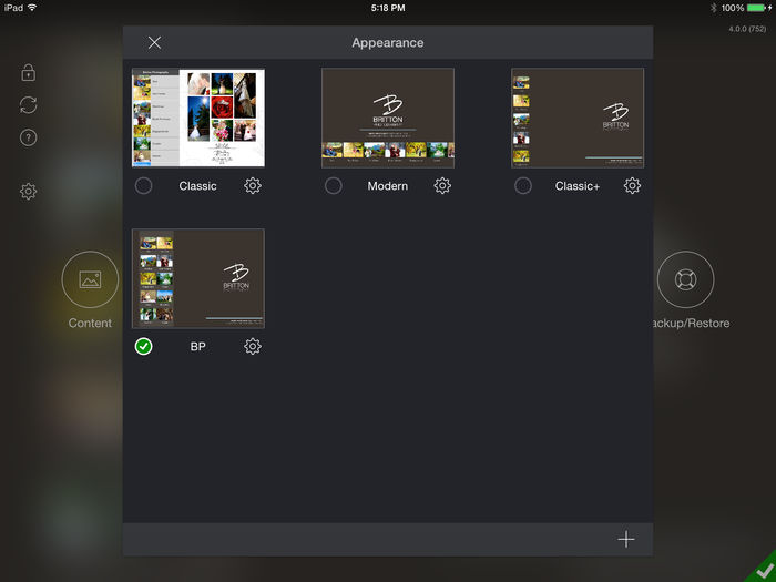
Portfolio 4.0
Content
Content is key to making Portfolio actually useful. Without it, the viewer is just a bunch of buttons. The original content manager was a two-column panel: one for adding, removing, and editing galleries (just galleries at this point – no folders), and one for interacting with the files loaded into a gallery. Since then it has evolved significantly more functionality while keeping the same basic structure.
Portfolio 1.0 only supported image-based content. This was on iOS 3.2, which lagged behind the iPhone on iOS 4.0 until the two were unified around November/December 2010. The more recent additions to iOS that later made other types of content more practical to support didn’t exist then.
That first version also supported only two loading sources: the Camera Roll and a list of URLs. Dropbox’s SDK hadn’t been released yet, though it did become the first addition to the loading source options.
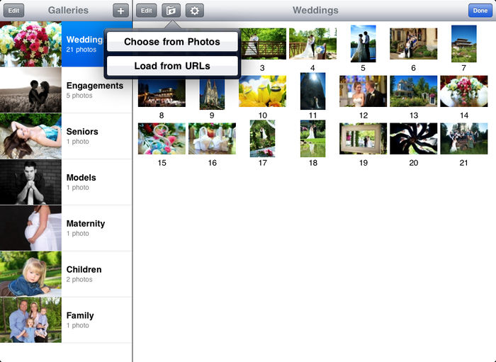
Portfolio 1.0
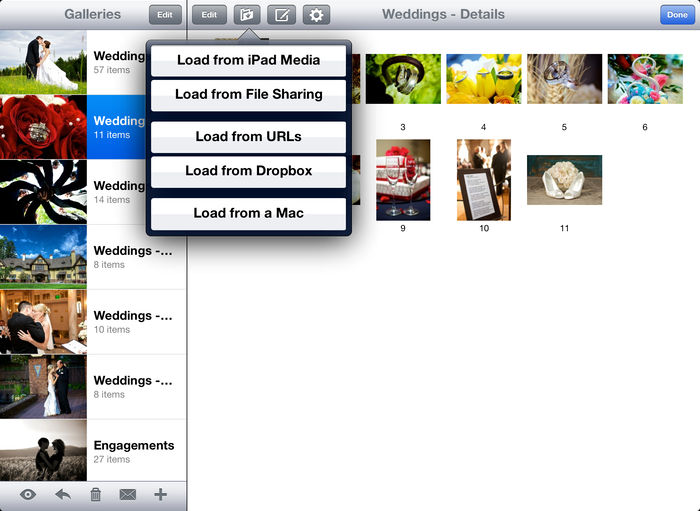
Portfolio 2.0
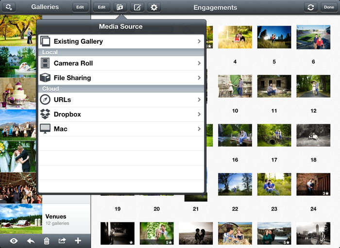
Portfolio 3.0
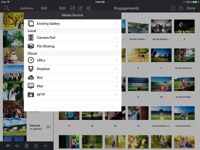
Portfolio 4.0
Viewer
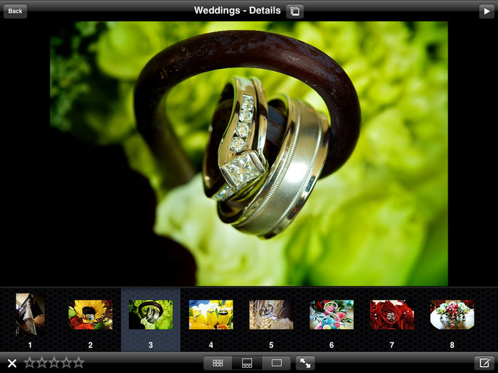
Most of the viewer’s changes have been far more subtle than the other portions of the app. Its initial behavior was modeled on how the native Photos app behaves, which has become the standard for photo browsing on iOS.
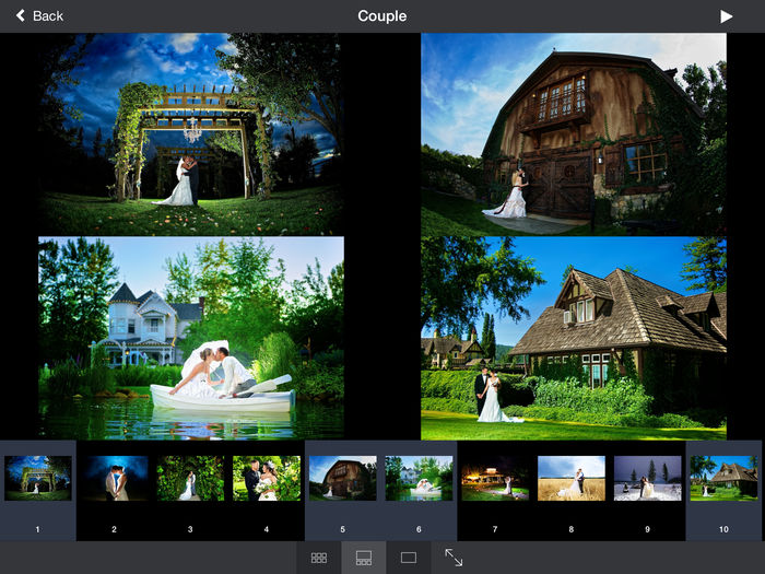
Version 1.4 brought the first revision of a compare mode.

This lasted until version 4.0, which introduced a completely new viewing engine making it possible to select even more.
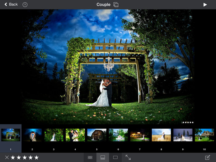
1.3 revealed the first major additions that led to many photographers using Portfolio as a client proofing tool.
Over time these have been adjusted and refined to where they sit in 4.0 today.
Beyond these aesthetic changes the viewer has also had significant development time devoted to both improving image loading performance as well as its quality.
Icon
Portfolio has seen only three significant versions of its icon. The second revision was introduced to match the new shape iOS 7 brought, and the third was done for Portfolio 4.0.
![]()
![]()
![]()
Other Changes
Other changes have often spanned multiple areas of the app. Each of Portfolio’s version groupings has had one or two central focuses. Some have addressed feature requests, others bugs, and some still iOS updates.
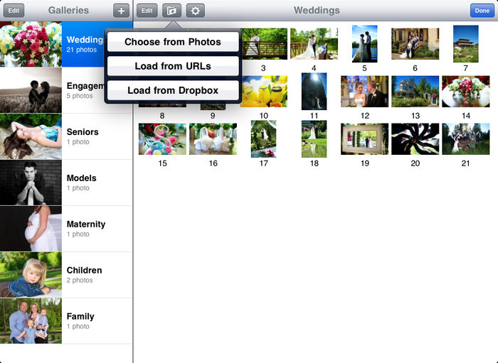
1.1 Dropbox
1.1 introduced support for loading from Dropbox and started the first of many steps to providing help directly in the app with a quick start panel.
1.2 Multi-Screen
This version brought the first multi-screen support and the ability to import and filter by IPTC keywords. While it’s common now, it’s important not to forget that the original iPad could not display on a second screen unless apps were specifically written to detect and use it.
1.3 Client Proofing
Client proofing support began with the additions in 1.3, providing support for individual ratings and notes for each image. It also included the first user manual.

1.4 Videos
Videos were the second supported content type to be added and came with the 1.4 update. This update also enhanced the proofing support in 1.3 by adding the ability to compare two photos side-by-side.
1.5 Metadata, PDFs, and More
Version 1.5 was one of the most significant updates in Portfolio’s history. It was built at the point where the iPad and iPhone SDKs joined with iOS 4.2, so it was finally able to take advantage of the many additions since iOS 3.2.
The ImageIO framework in iOS 4 made a lot of things available. Loading speed could be improved with access to the new APIs, it became possible to extract and display even more metadata, and PDFs were now easy to render and display.
Two other highlights of this release were the addition of a Mac-hosted loading program, which enabled bulk loading without an internet connection, and a way to backup and restore the library without having to do a full device restore through iTunes.
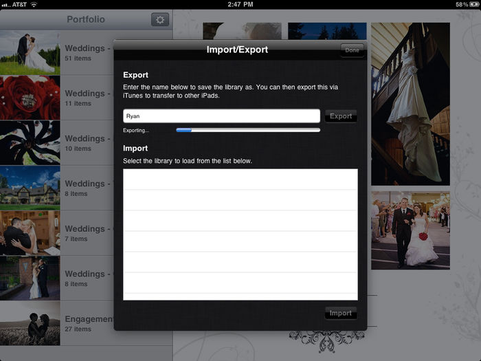
2.0 Folders and Polish
Folders were a long-requested feature to make it easier to build a content hierarchy. 2.0 made the changes necessary to the underlying storage system to make it possible. I also spent the time implementing a number of other requests that added to the overall polish of the app.
2.1 Exporting and Filtering
One of the most surprising requests I’ve received (on more than one occasion) is to get files back out of Portfolio since the originals were lost. It happened enough that it became one of 2.1’s key features. 2.1 also brought enhancements to the viewer, mainly along the lines of filtering the current view to help with photo proofing.
3.0 Themes and Synchronization
The two focuses for 3.0 were to address long-requested items. Users wanted more appearance customization and they also wanted automatic synchronization with a service like Dropbox. In addition to each of these, 3.0 also brought a large number of fixes and improvements to bring it up to speed with iOS updates.
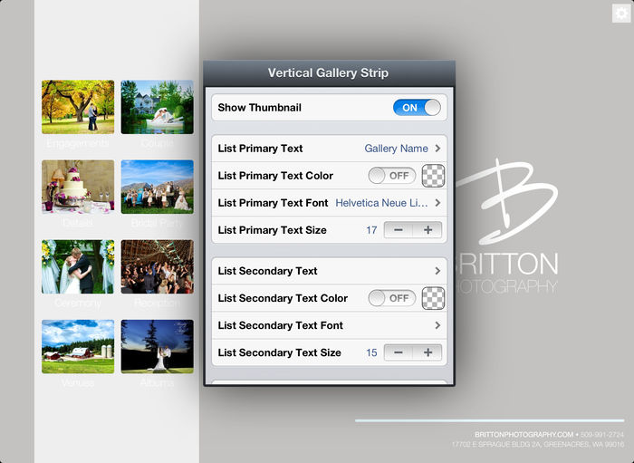
3.1 iOS 7
iOS 7 is notable for bringing the largest number of UI changes in the life of iOS. It introduced so much that it needed an entire line of updates focused just on the changes in it.
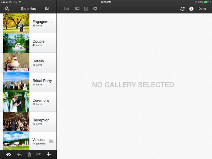
3.2 Performance
When iPads first got their Retina display it meant that Portfolio suddenly had to load images four times the previous size in the same timeframe. 3.2 was an update to focus on improving the performance and responsiveness of the interface, particularly when viewing.
3.5 SFTP
Many companies use Portfolio, often for confidential materials. SFTP support provided for a loading option that avoids any 3rd party services.
4.0 Overhaul
For any project worked on for the length of time Portfolio has been, it develops a certain amount of cruft, both in the code itself and in the interface. 4.0’s sole goal was to remove as much of this as possible. Almost every component was revisited to remove the old and unused bits that had accumulated as well as to bring the UI up to current standards.
