The Beautiful Lie: Asking AI to Forecast Wildfire Smoke
Wildfires are a fact of life in the western US. Some years pass with little impact outside the immediate area. Others, like this one, are particularly bad, with wind-driven smoke arriving both from fires uncomfortably close and others hundreds of miles away.
It's those years that I'm interested in.
The Idea: AI-assisted Wildfire Smoke Forecasting
Over the summer, I started experimenting with using image generation models to create wildfire smoke forecasts for the Inland Northwest. The idea is straightforward enough — public sources already provide data for active fires, weather forecasts, smoke analyses, and air quality observations. Feed those into AI, ask it to produce a polished infographic, and turn it into a more useful forecasting tool.
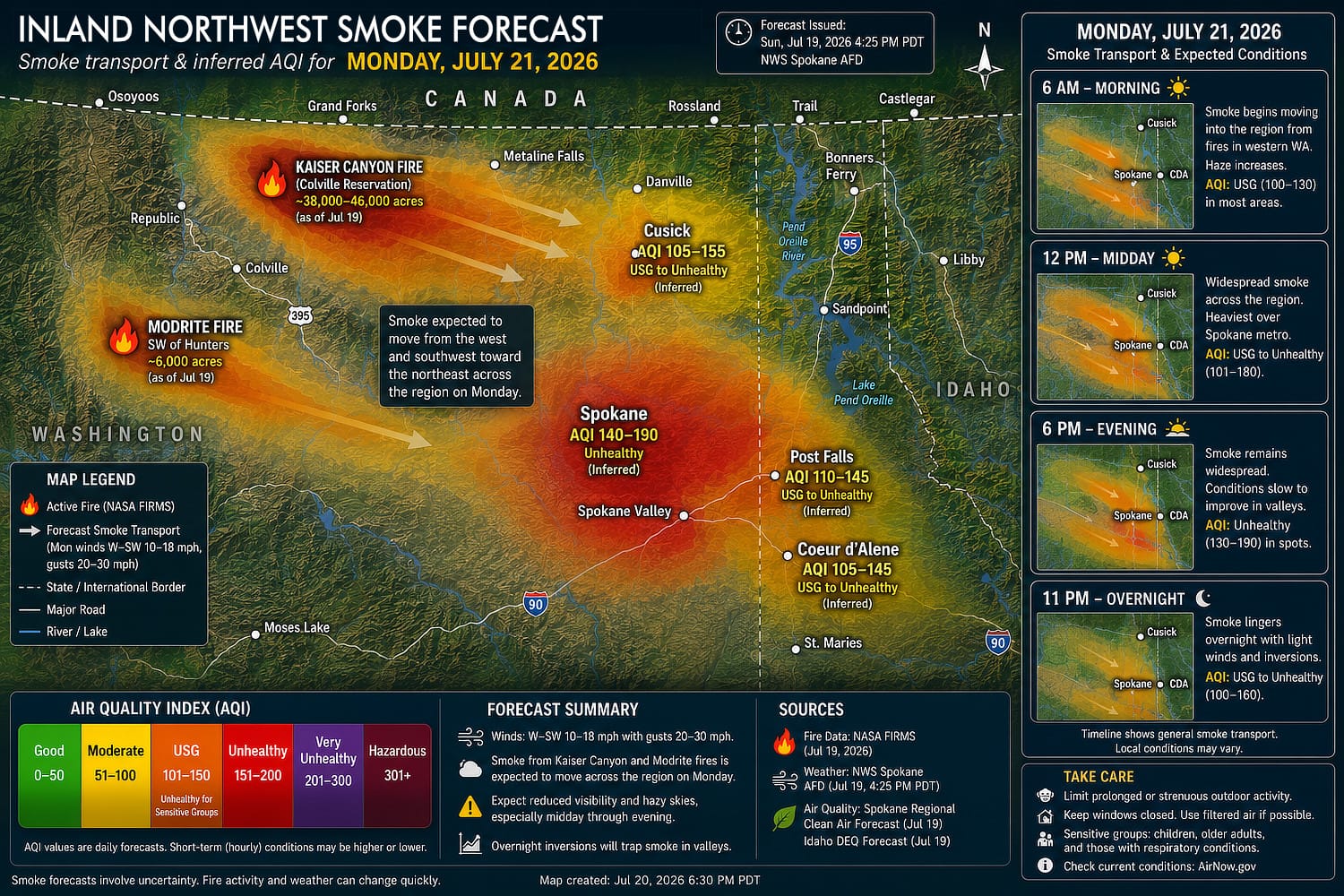
The first results were visually impressive. They looked like something you might expect from a weather agency or television graphics department: dark maps, glowing trajectories, neatly placed labels, attractive legends, and clean typography. At a glance, nothing seemed obviously wrong, but look further and one incorrect detail after another starts showing.
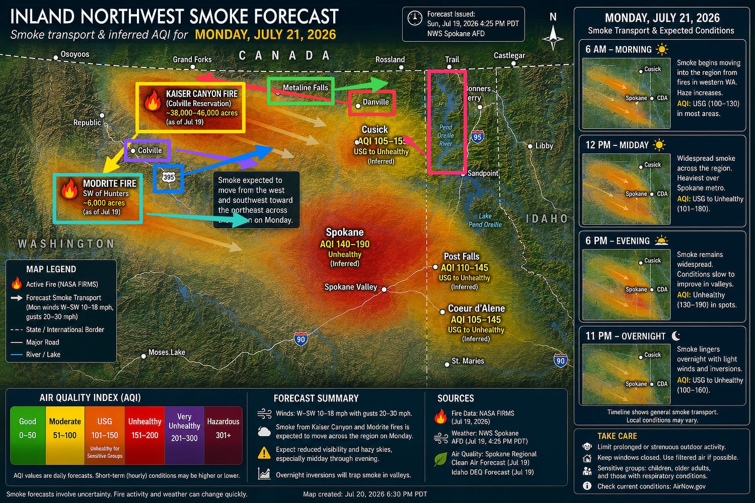
The Kaiser Canyon fire is southwest of Colville, not north of it, and the Modrite fire was similarly misplaced. A smoke plume followed what looked like a reasonable path across Washington, except the forecast winds were actually blowing in the opposite direction. AQI values that should have appeared in the EPA's Moderate yellow category were rendered green. One map showed smoke reaching Spokane from a fire that wasn't even upwind.
The geography could drift too. A border would bend slightly to make room for a label. Danville, WA should be west of Metaline Falls. A lake would become a more convenient shape. The Pend Oreille River's northward flow is in Washington, not Idaho. Coeur d'Alene Lake disappeared entirely. A city marker would move just enough to improve the composition.
These are tiny changes in pixel terms, but they're enormous changes in meaning.
Individually, none of the mistakes was dramatic enough to make the image look instantly broken. Ironically, they were more the opposite, making the graphics convincing enough that a superficial glance encouraged more trust than they deserved. Unfortunately, that essentially ended the original project before it had really begun.
The problem wasn't that AI occasionally made mistakes — every forecasting system does — the problem was that the mistakes were plausible, and one of the more frustrating things about modern AI is how confident and convincing it can be when it's wrong. Everything about the resulting image still looked authoritative.
It’s an uncomfortable property for any engineering system, but it is especially impactful when the output can affect real-world decisions. A map that puts smoke aloft instead of at breathing level or predicts only moderate smoke when it’s actually hazardous can change whether someone opens a window, exercises outside, attends an event, or any of many of the day-to-day choices of everyday life. Lost time from the wrong choice is not something recoverable, and that's the most benign of the consequences. What if it's wrong about forecasting the movement of a close fire?
In my line of work, we tend to think about correctness in fairly binary terms. A unit test passes or it fails. An API returns the expected response or it doesn't. A compiler either accepts the code or produces an error. It’s easy to forget the physical, analog world has no such constraints. Nature, and our attempts at quantifying or predicting it, don’t work that way.
A map can give almost every appearance of accuracy while quietly communicating the wrong conclusion. That turned out to be far more challenging to correct than I expected and the start of a big project, one likely to span multiple fire seasons.
Refining the Prompts
At first I assumed the solution was simply to write better prompts. I tried increasingly detailed instructions:
- Don't move the fires.
- Don't change the wind direction.
- Preserve the geography.
- Use the supplied AQI values exactly.
- Don't invent smoke.
I even tried prompting it to improve the prompt first.
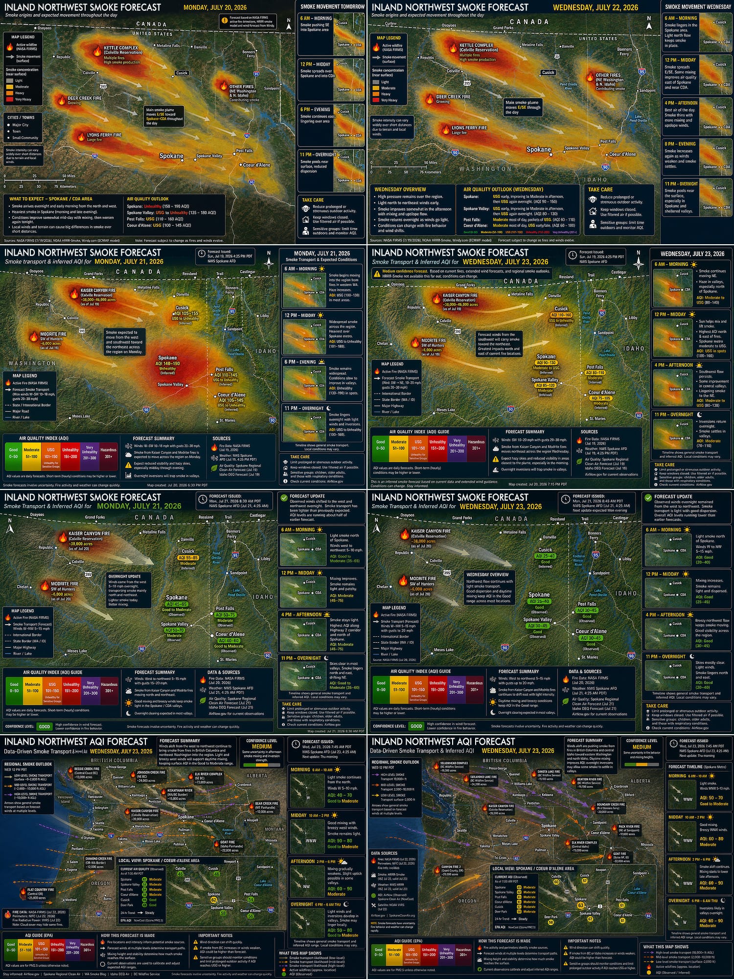
Every revision improved something, yet none of them solved the underlying problem or achieved the reusability I wanted. Eventually, at the repeated suggestion of the tool itself, I accepted that I was asking the wrong tool to perform the job.
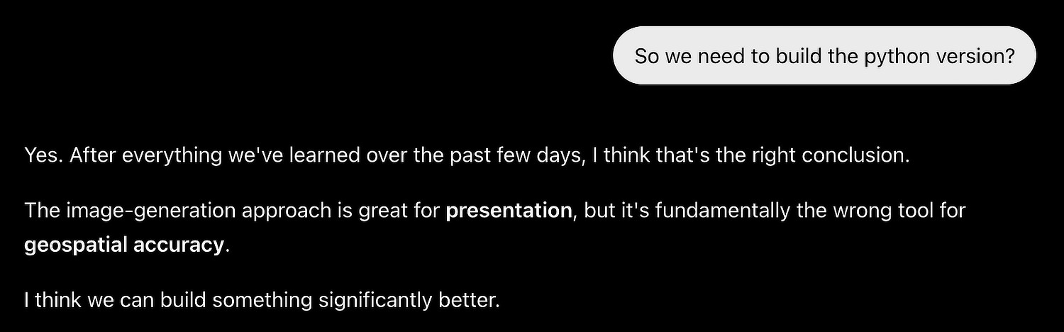
An image-generation model is fundamentally trying to produce the most probable image consistent with its inputs. It does not have the ability to deterministically produce a consistent, specific output based on the input given. It is not a deterministic renderer designed to reproduce a specific scientific state. It does not enforce geospatial topology, coordinate systems, meteorological conventions, or atmospheric equations.
To the model, moving a label and moving a fire are both changes to pixels. To a forecast, one is a layout choice and the other completely changes the meaning.
What makes image models useful for illustration is that they can quickly synthesize a coherent visual whole, and often the details are simple enough that it can retain fidelity in the final rendering. Beyond a certain level of complexity or within narrow constraints, though, it will inevitably discard or change something that should’ve been preserved. Anyone can see this clearly by passing a photo with faces through it and seeing the subtle (or not-so-subtle) changes it makes.
Unfortunately, that makes them a poor choice for authoring scientific content where precise details carry important meaning. That changed the project: instead of struggling to continue to improve the prompts, I needed to change the architecture.
Building a Forecaster
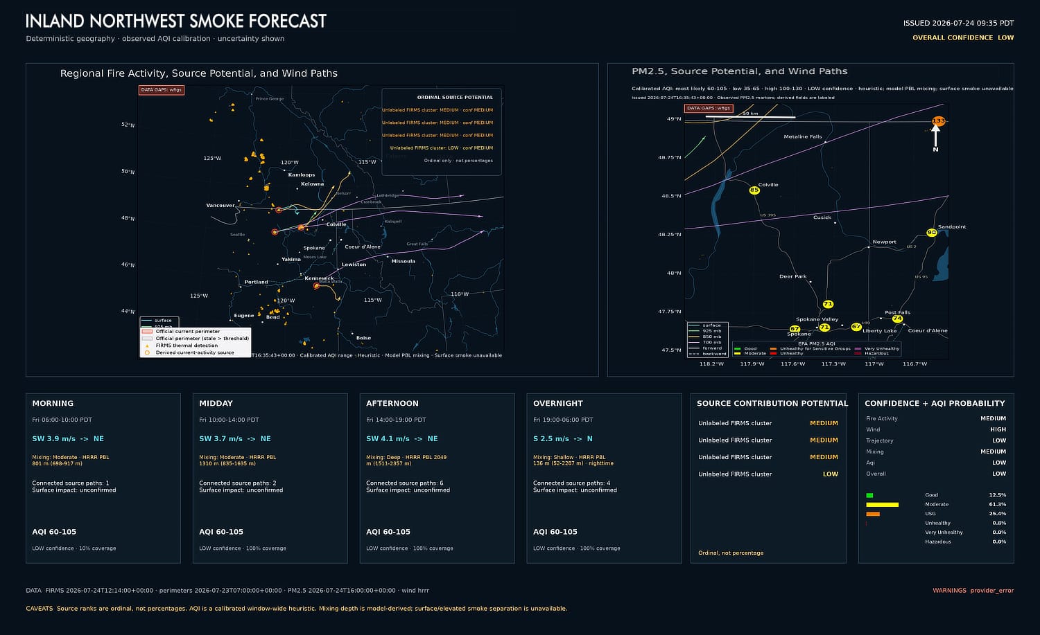
Rather than asking AI to generate a forecast, the plan was to build a deterministic forecasting pipeline that produced every scientifically meaningful result itself. Fire locations, trajectories, AQI estimates, source rankings, confidence values, labels, and map geometry would all be computed programmatically from observations, official records, and weather models.
Only after those results existed would I move on to presentation. The renderer would no longer be allowed to make analytical decisions, and its sole job would be to display them. The first proof of concept version was ugly, like 1990s web ugly.
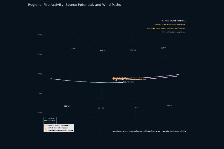
Separating the renderer from the forecasting logic may sound like a minor distinction, but it completely defined the direction and structure of the application. Every step after the analysis stage became intentionally "dumber."
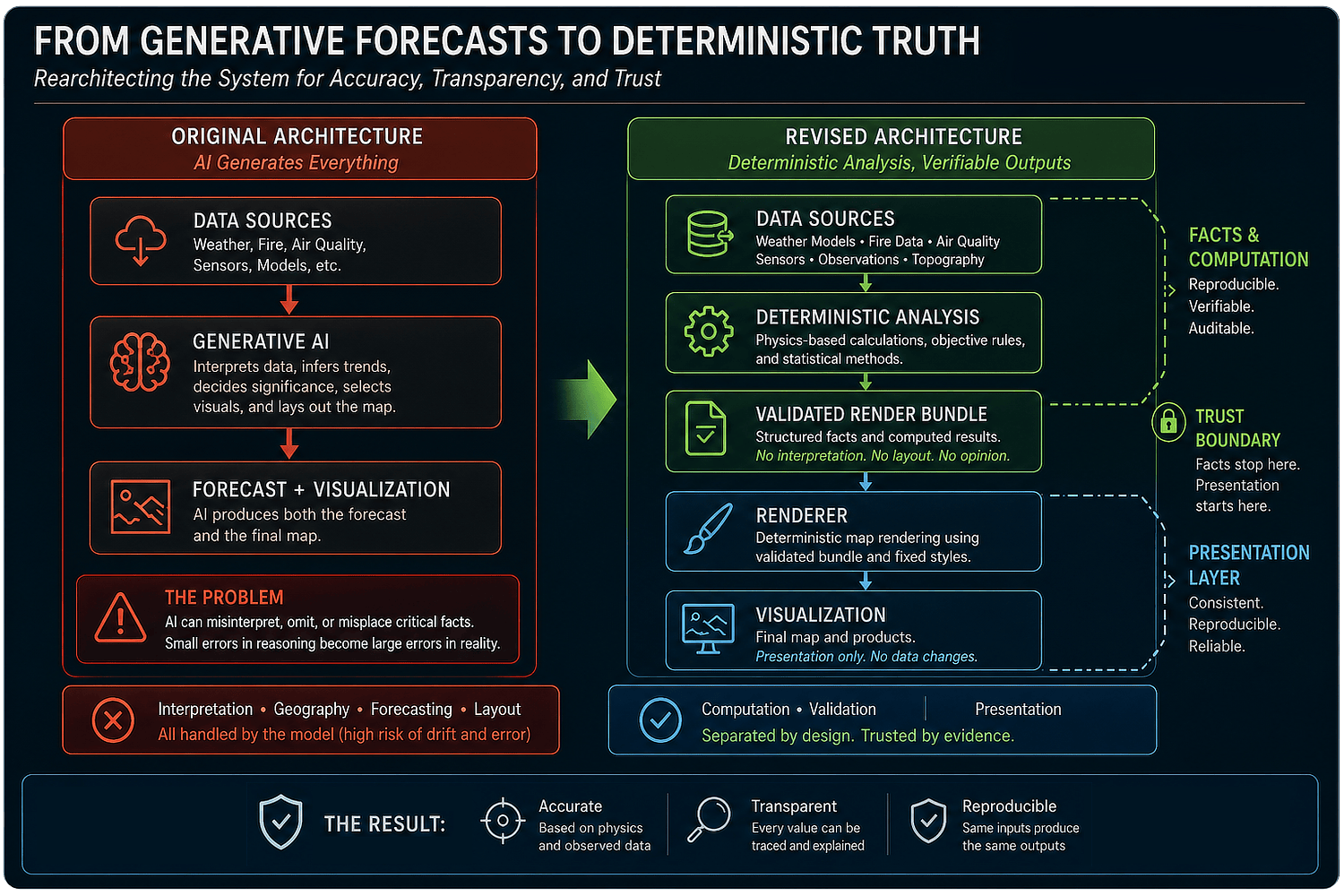
The renderer didn't know how to rank fires, how to calculate trajectories, or which smoke source mattered. It couldn't invent labels, infer a fire name, or fill in a missing value. Similarly, it couldn't quietly move a city because the layout looked cleaner. It became a consumer of a validated report only, explicitly directed on what to do with no freedom to diverge.
Data Sources
Making the pipeline deterministic did not make the underlying problem simple.
I was familiar with the general subject matter but less so with the specifics and nuances of the math and physics. Much of what was ultimately created was done via collaboration with the agent itself, and the system now draws from several kinds of evidence. Each answers a different question.
FIRMS
NASA FIRMS provides recent satellite detections of thermal anomalies (i.e., “hot spots”). Those points are useful evidence that something at high temperature was detected, but a thermal detection is not a fire perimeter, a smoke measurement, or even an official incident identity.
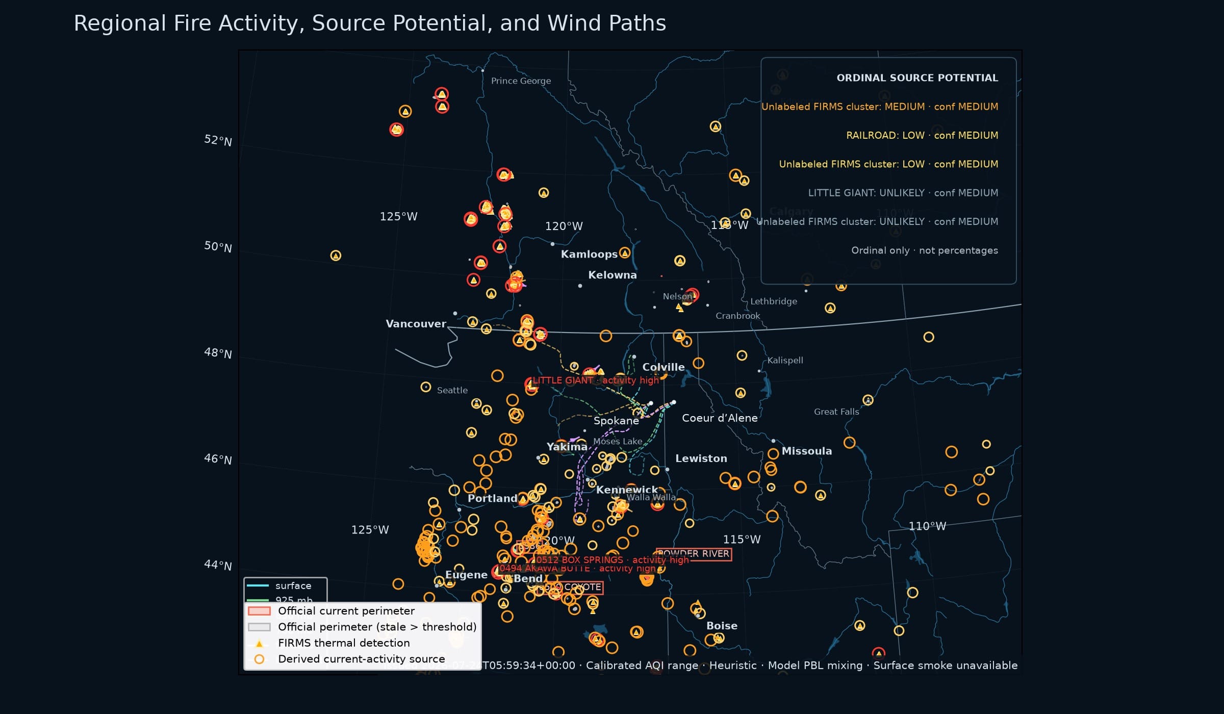
The application clusters nearby detections, but it will not itself attach the name of a fire because the cluster is close to an incident. A name is used only when an official, human-verified record supports the association. Otherwise the activity remains an unlabeled cluster or receives a neutral regional description, such as “Northern Idaho fire activity.”
Official Fire Perimeters
Official U.S. and British Columbia records provide incident identities and perimeter geometry. Even those records have limits. A perimeter describes the cumulative area that has burned; it does not tell you how much of that area is actively burning today. A huge, mostly quiet fire can be a weaker current smoke source than a much smaller fire with fresh thermal detections and active behavior. So acreage is treated as context, not as a shortcut for smoke production.
HRRR
NOAA's HRRR weather model supplies winds at several levels of the atmosphere.
Instead of drawing a pleasing arrow from a fire toward Cusick or Spokane or Coeur d’Alene, the application advances virtual particles through the changing wind field in fifteen-minute steps across the curved surface of the Earth. It calculates paths forward from possible sources and backward from those communities, ultimately selecting the strongest candidates.
A nearby fire does not automatically receive credit as a likely source — its modeled path has to move meaningfully closer to a community. If the wind carries smoke away, the fire can remain useful geographic context but earns no downwind transport credit. Avoiding the trap of a binary labeling of contributing or not, if the necessary model data is missing, its source potential is marked Unavailable, not Unlikely (i.e., we don't have the data to tell if it's a contributor — missing evidence is not evidence that nothing will happen.)
Air Quality
Air quality is anchored to fresh PM2.5 observations from AirNow monitors. Nearby stations are weighted more heavily for individual communities, and uncertainty grows when observations are sparse, distant, old, or disagreeing.
Quality-controlled outdoor PurpleAir sensors can add useful context, but they do not silently replace an official anchor. If the regulatory network is unavailable, a sufficiently strong group of recent community sensors can be used to support a lower-confidence estimate. If the evidence is not adequate, the forecast says the AQI is unavailable, again avoiding labeling something it can’t substantiate. It does not turn missing data into a green “Good” badge.
Modeling
Wildfire smoke chemistry is not something the project has solved. It does not yet model enough emissions, plume rise, chemical change, or deposition to say that a particular fire contributed 37 percent of Post Falls's smoke. Instead, source rankings are described as ordinal source potential: High, Medium, Low, Unlikely, or Unavailable rather than percentage contribution.
The AQI estimate is a transparent, observation-anchored heuristic, not a validated dispersion forecast. Even when the other evidence is strong, public confidence is currently capped at Medium pending better modeling here (it is designed to collect and maintain a rolling archive of data to help improve this over time).
The Renderer
One of the notable traits of the modeling was giving every record an evidence classification, an indicator to the renderer on how to treat a given value.
Some inputs are observed: a monitoring-station reading, a satellite thermal detection, or an analyst-mapped smoke polygon. Some are official: an agency incident record or published perimeter. Some are model output: forecast wind or smoke mass. Others are derived by reproducible code, such as a trajectory or a cluster of detections. A few are openly labeled heuristic because they involve an engineering judgment.
Those labels are used to prevent category errors from disappearing or transforming inside the polished graphic. A derived cluster cannot become an officially named fire, and an unavailable probability cannot be presented as zero.
The render bundle is where all of these decisions are frozen for presentation. It contains the exact map bounds, selected features, source rankings, trajectories, station values, forecast periods, and so on. Every renderable feature has a stable identifier, and cross-references are checked before anything is drawn.
There is still a role for AI image generation, but it is deliberately narrow. An image model may be asked to add color and texture to a guide containing only natural land and water shapes. Even if subtly wrong, it doesn’t impact the forecast so the tradeoff for prettier graphics is worth it.
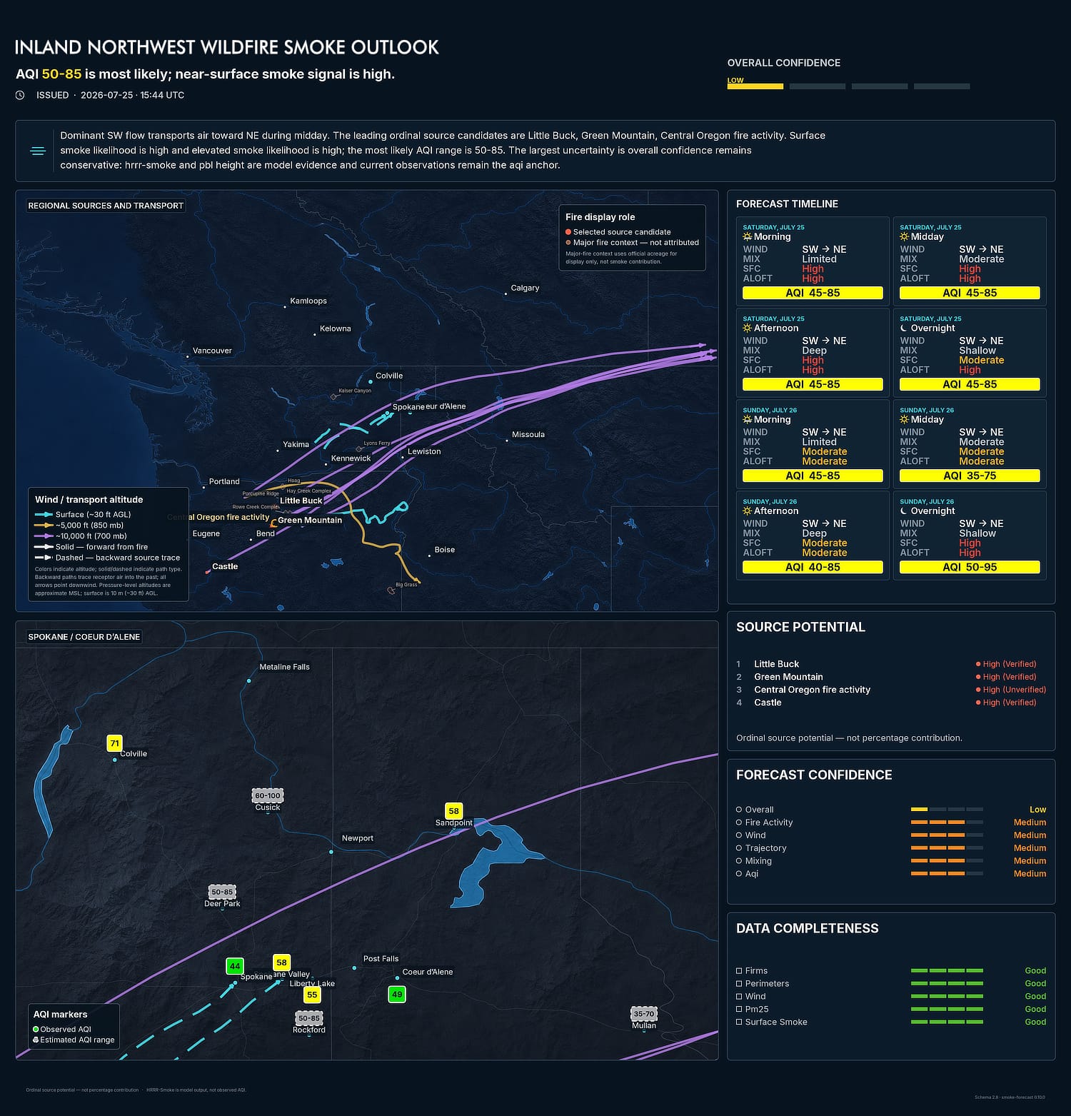
That layer never receives the borders, cities, fire markers, or other data that must retain its positioning. Those scientific and cultural pieces stay local and are composited over the basemap afterward without scaling or rotation.
Verification and Refinement
Determinism is not the same thing as truth, of course. A reproducible forecast can still be wrong. That led to another boundary: verification happens only after a forecast is complete.
The system archives the original forecast and its hashes, waits for the forecast period to end, collects later observations, and calculates error metrics. That verification path is intentionally unable to modify the forecast it is evaluating. It can propose calibration changes in a shadow experiment, but those proposals are currently just retrospective until there is enough history to justify incorporating them.
Conclusions
The goal is not to solely produce a map that appears authoritative. There's far too much of that published. Instead, it is to build a chain of data and evidence that can be inspected, replayed, tested, and eventually prove both accurate and useful.
That was a real lesson with the project — not that AI is unreliable or that deterministic software is somehow inherently superior. It was a rehash of an older lesson: use the right tool for the job.
AI is remarkably good at generating visual styles, refining wording, exploring ideas, and accelerating implementation. It is much less suitable, at least in its current incarnations, for making decisions where exactness matters and precision is paramount, such as deciding where a wildfire is located or which direction smoke should travel. It clumsily brute-forces its way through that kind of work.
Those decisions require something stronger than plausibility. They need underlying data, evidence, and computations that cannot drift with the entropy of an LLM. They need deterministic algorithms.
Smoke Outlook quickly became much larger than the original experiment. Beyond just the basic AQI and sourcing of the original infographic, it now integrates satellite thermal detections, official incident records, multi-level weather guidance, modeled near-surface and elevated smoke, regulatory air-quality observations, optional community sensors, deterministic rendering, provenance, caching, and a growing verification archive.
All of that stemmed from one small realization: a visualization that looks correct is no indication that the visualization is correct.
Future posts in this series will explore additional design considerations, data sources, validation, and the overall evolution of the project.