
Introduced in iOS 8, UITraitCollection added the concept of size classes to the iOS autolayout system. As we found out a year later in iOS 9, the primary purpose of these was to allow for adapting the interface layout for multitasking. The default size classes look like this:
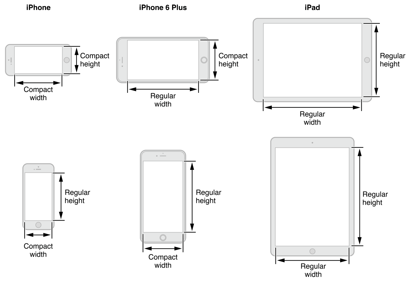
Unfortunately, this isn’t very useful if you’re looking to tailor the UI to each device type/orientation combo. Only the iPhones differ at all when the orientation changes, and the iPad’s size classes end up all over the board as soon as you throw multitasking into the mix:
On a recent project I needed to be able to adjust the interface in response to an orientation change, and I wanted to be able to do it with minimal code (you know, the whole point of storyboards). The default size classes wouldn’t even come close to facilitating this, especially on the iPad. This is what I needed to accomplish:
It’s important to note that I do not need to support multitasking — this app is intended to be run full screen rather than alongside another. As a result, the approach I took would likely not adapt well to that environment.
Uniquely identifying device/orientation combos
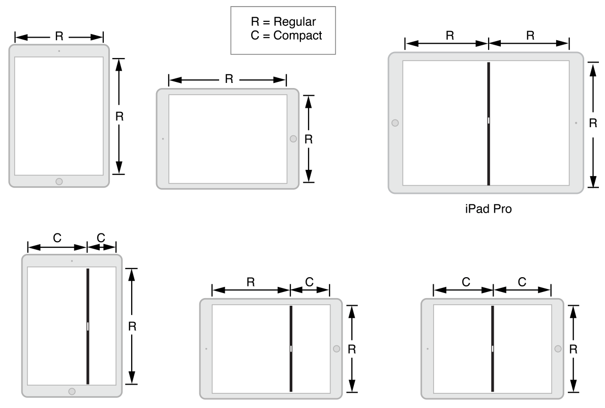
To accomplish having different layouts in each orientation for each device type I needed some way to uniquely identify the combo using only size classes. Conveniently, there are exactly four unique size class pairings to match the four unique device/orientation pairings. I ended up with this division:
- W Regular / H Regular: iPad Portrait
- W Regular / H Compact: iPad Landscape
- W Compact / H Regular: iPhone Portrait
- W Compact / H Compact: iPhone Landscape
While not strictly adhering to the standard definitions of the size classes, I feel they adequately convey the context of the environment they’re describing.
Overriding the default size classes
The overall app wraps its controller hierarchy in a navigation controller. This proved to be the ideal point for overriding the default size classes. Subclassing UINavigationController, the code for this was very simple:
override func viewWillAppear(animated: Bool)
{
    super.viewWillAppear(animated)
    self.returnPortraitTraits = self.view.frame.height > self.view.frame.width
}

override func viewWillTransitionToSize(size: CGSize, withTransitionCoordinator coordinator: UIViewControllerTransitionCoordinator)
{
    self.returnPortraitTraits = size.height > size.width
}

override func overrideTraitCollectionForChildViewController(childViewController: UIViewController) -> UITraitCollection?
{
    if UIDevice.currentDevice().userInterfaceIdiom == .Phone
    {
        //iPhone Portrait
        if self.returnPortraitTraits
        {
            let horizontalTrait = UITraitCollection(horizontalSizeClass: .Compact)
            let verticalTrait = UITraitCollection(verticalSizeClass: .Regular)
            return UITraitCollection(traitsFromCollections: [horizontalTrait, verticalTrait])
        }

        //iPhone Landscape
        let horizontalTrait = UITraitCollection(horizontalSizeClass: .Compact)
        let verticalTrait = UITraitCollection(verticalSizeClass: .Compact)
        return UITraitCollection(traitsFromCollections: [horizontalTrait, verticalTrait])
    }

    //iPad Portrait
    if self.returnPortraitTraits
    {
        let horizontalTrait = UITraitCollection(horizontalSizeClass: .Regular)
        let verticalTrait = UITraitCollection(verticalSizeClass: .Regular)
        return UITraitCollection(traitsFromCollections: [horizontalTrait, verticalTrait])
    }

    //iPad Landscape
    let horizontalTrait = UITraitCollection(horizontalSizeClass: .Regular)
    let verticalTrait = UITraitCollection(verticalSizeClass: .Compact)
    return UITraitCollection(traitsFromCollections: [horizontalTrait, verticalTrait])
}
The Future
For myself, there’s no question that UITraitCollection needs to expand. .Regular and .Compact aren’t nearly granular enough to cover a lot of potential use cases, and with the potential for additional screen sizes down the road, this may only get worse.
What if this app did need to adapt to the various multitasking configurations? It would be virtually impossible to avoid significant amounts of code to adjust the interface. At the very least, UITraitCollection needs some ability to uniquely target both the device type and orientation without having to redefine what .Regular and .Compact are. Apple has done it before, most notably with the push towards autolayout itself and deprecation of autoresizing masks.
Ultimately I’d like to see something akin to CSS media queries. Let developers define the points where layouts change rather than using the very arbitrary .Regular and .Compact. Like the web, different change points make sense for different projects, especially as screen sizes and shapes further diverge.